
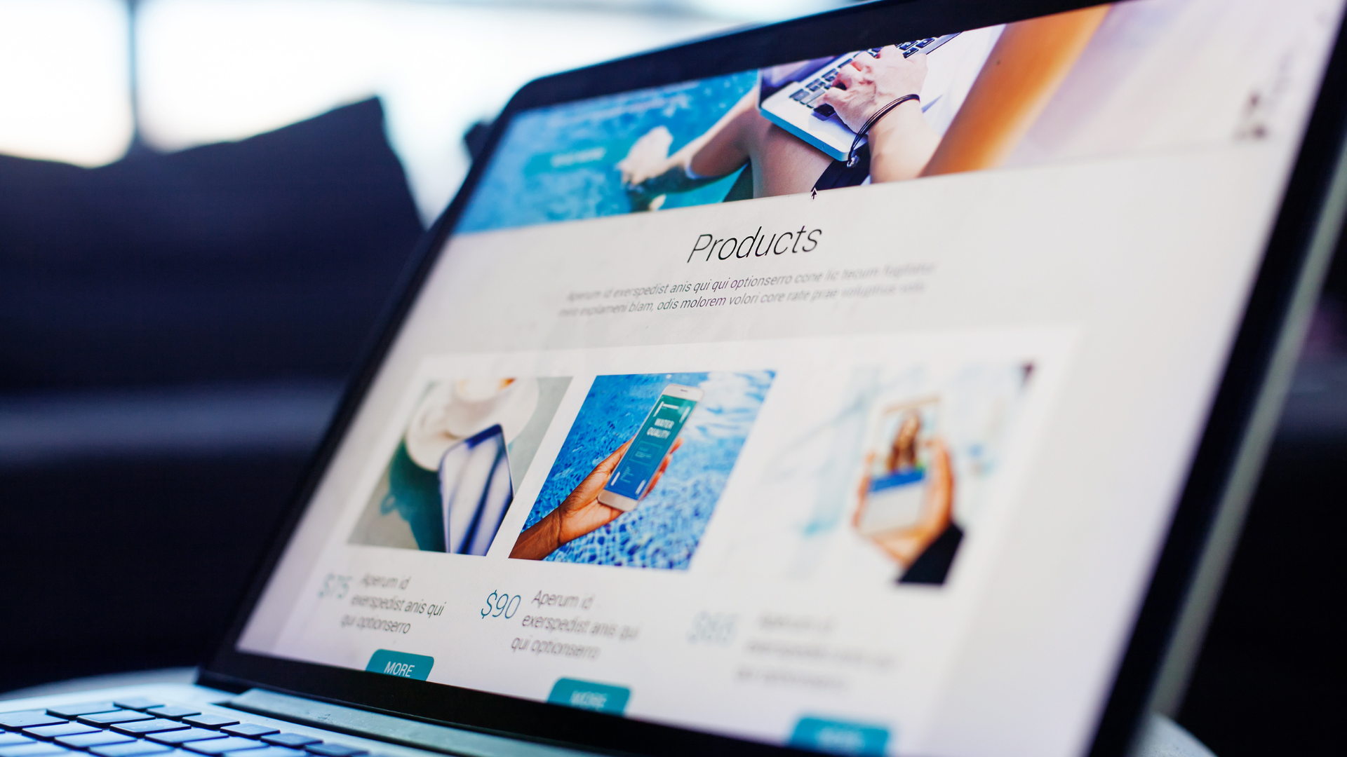
Someone lands on your site from their phone while waiting for coffee. If the text is too small to read or the buttons are impossible to tap, they’re gone within seconds. That single moment, repeated thousands of times a day across devices, is exactly why responsive design has become such a central part of website design & development for businesses of every size.
Responsive design isn’t just a technical checkbox anymore. It shapes how visitors feel about a brand, how long they stick around, and ultimately, whether they convert into customers.
What Responsive Website Design Actually Means
Responsive design is an approach to building websites so they automatically adjust their layout, images, and navigation based on the screen they’re being viewed on. A well-built site should feel just as natural on a laptop as it does on a tablet or smartphone, without the visitor having to pinch, zoom, or scroll sideways to find what they need.
This is different from simply having a “mobile version” of a site. Older approaches often built two separate sites, one for desktop and one for mobile, which created extra maintenance work and inconsistent experiences. Modern custom website design services use flexible grids, scalable images, and CSS media queries so a single site adapts fluidly across every device.
Why It Matters for Modern Businesses
More than half of global web traffic now comes from mobile devices, and that share keeps growing. If a site isn’t built to respond to that shift, businesses are effectively turning away a large portion of their potential customers before they’ve even had a chance to read the homepage.
There’s also a trust factor at play. Visitors form an opinion about a business within seconds of a page loading. A cramped, hard-to-navigate layout signals that a business hasn’t invested in its digital presence, and that impression can carry over to how people judge the product or service itself. A clean, responsive layout does the opposite. It tells visitors this business pays attention to detail.
The Direct Link Between UX and Conversions
Good user experience and strong conversion rates aren’t separate goals, they’re closely connected. When a visitor can find what they’re looking for quickly, whether that’s a product page, a contact form, or pricing information, they’re far more likely to take action.
A few ways responsive design directly supports conversions:
- Faster load times. Optimised images and streamlined code for mobile screens mean pages load quicker, reducing the chance a visitor leaves before the page even finishes rendering.
- Easier navigation. Menus that collapse sensibly and buttons sized for touchscreens make it simple for visitors to move through a site without frustration.
- Consistent branding across devices. When a site looks and feels the same on every screen, it builds familiarity and confidence, especially for visitors who browse on mobile first and then return on desktop to complete a purchase.
- Better readability. Text that resizes appropriately, rather than shrinking to an unreadable size, keeps visitors engaged with the content rather than fighting the layout.
For ecommerce businesses in particular, this matters enormously. Ecommerce website development that isn’t responsive often sees high cart abandonment rates simply because checkout forms are fiddly to use on a phone.
Common Mistakes Businesses Make
Even businesses that know responsive design is important sometimes get the execution wrong. A few patterns come up again and again:
- Treating mobile as an afterthought. Designing for desktop first and then trying to squeeze that layout onto smaller screens rarely works well. It’s far more effective to consider mobile behaviour from the start.
- Ignoring page speed. A responsive layout that still loads slowly on mobile data connections undoes a lot of the benefit. Image compression and clean code matter just as much as layout flexibility.
- Overcomplicating navigation. Too many menu items or nested dropdowns can overwhelm mobile visitors. Simpler is almost always better.
- Forgetting about SEO friendly website design. Google primarily uses mobile-first indexing, which means a site’s mobile experience directly affects how well it ranks in search results. A site that looks great on desktop but performs poorly on mobile can quietly lose search visibility over time.
Best Practices Worth Following
Getting responsive design right doesn’t require reinventing the wheel. A few practices consistently deliver good results:
- Design with mobile behaviour in mind from the earliest wireframes, rather than adapting a desktop layout afterwards.
- Test across a genuine range of devices and screen sizes, not just the browser’s built-in preview tool.
- Keep forms short and touch-friendly, particularly for lead generation and checkout pages.
- Compress images and use modern formats to keep load times low without sacrificing visual quality.
- Pay attention to landing page design services for campaign-specific pages, since these often carry the highest stakes for conversion.
Real-World Impact
Businesses that invest in professional website design and development services often see the difference play out in practical terms: longer average session times, lower bounce rates, and more completed forms or purchases. A corporate website design that used to lose visitors on mobile can become one of the strongest sources of enquiries, simply by making the experience frictionless on every device.
This holds true whether the platform is WordPress website development, Shopify website design, or a custom-built solution. The platform matters less than the discipline of designing responsively from the outset.
Key Takeaways
- Responsive design ensures a site works well across every device, not just desktop.
- Mobile traffic now makes up the majority of web visits, so a poor mobile experience directly limits growth.
- Good UX and strong conversion rates go hand in hand, from load speed to navigation to readability.
- Common mistakes include treating mobile as secondary, ignoring page speed, and overcomplicating menus.
- SEO friendly website design and responsive design are closely linked, thanks to mobile-first indexing.
Final Thoughts
A website is often the first real interaction a potential customer has with a business, and that first impression carries weight. Responsive website design and development isn’t a nice-to-have anymore, it’s the foundation for a site that performs well, ranks well, and converts visitors into customers regardless of the device they’re using.
If your current site feels clunky on mobile or conversions have been slipping, it might be worth reviewing how well it actually responds across devices. Here at Admosis we work with Australian businesses on website design and development, from custom builds through to high-converting website design tailored to specific goals. Have a look through our website design and development services or get in touch to talk through what a responsive redesign could do for your conversion rates.